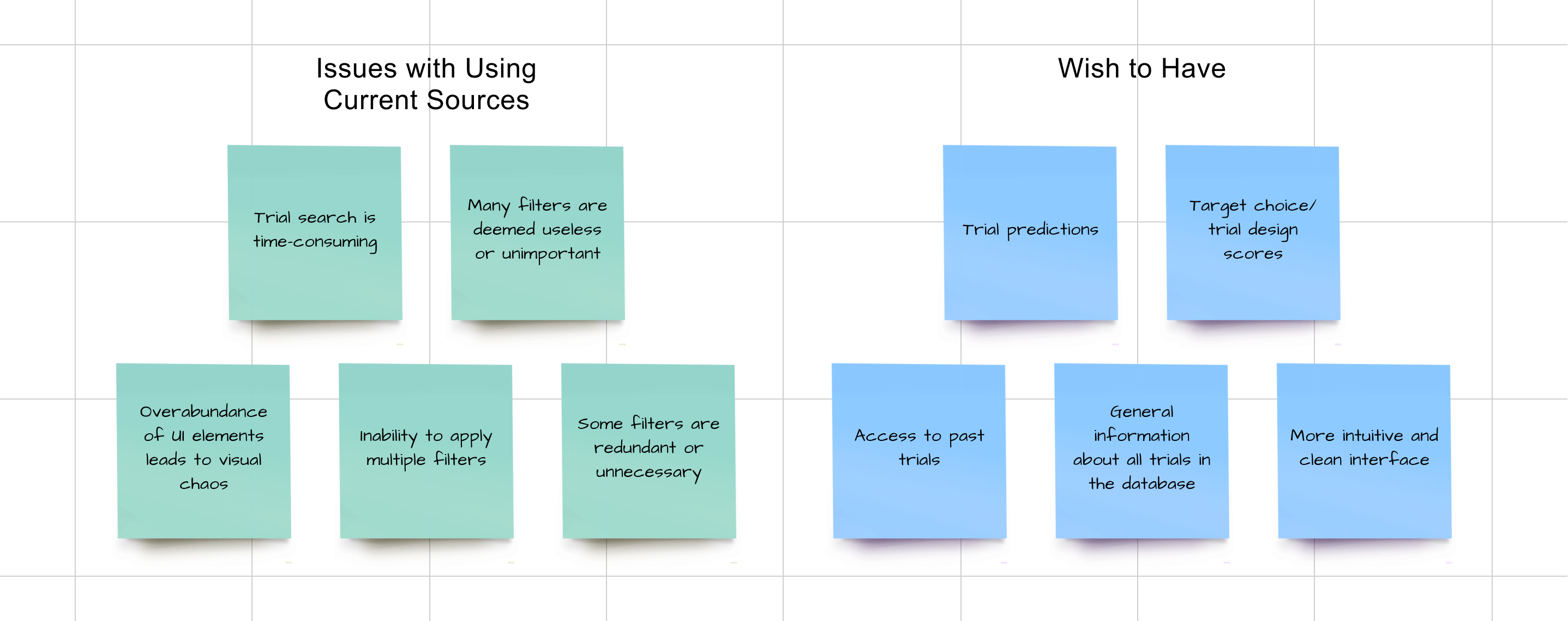
We conducted a series of interviews with multiple users of the platform to gain insight into their expectations for the database dashboard and their opinions on the current sources they use. The survey comprised a combination of open-ended and closed questions.
In total, 11 participants responded to the surveys. The results we obtained aided in pinpointing potential content and features for the future dashboard with greater precision.
Overview 📌
DASHBOARD
background
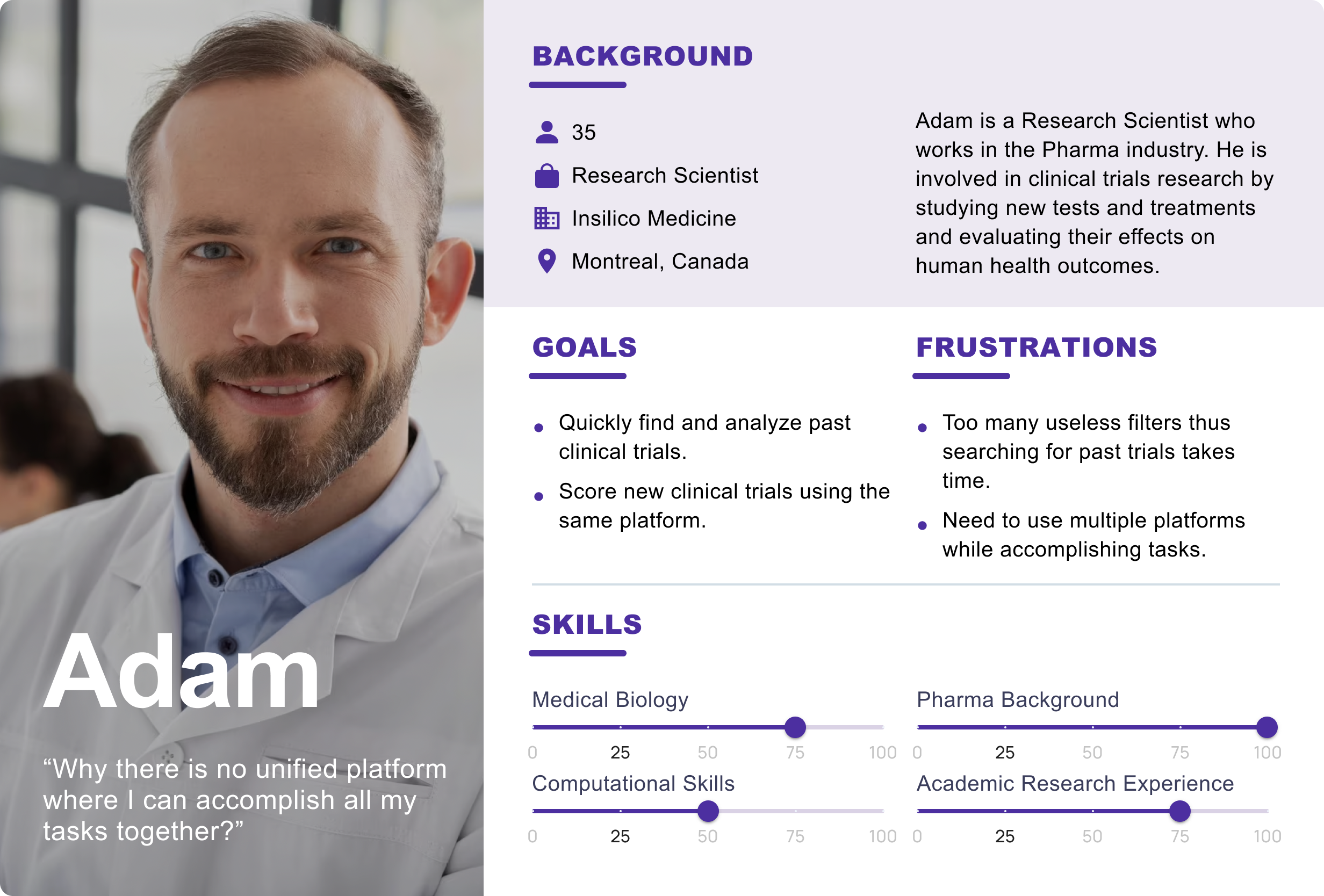
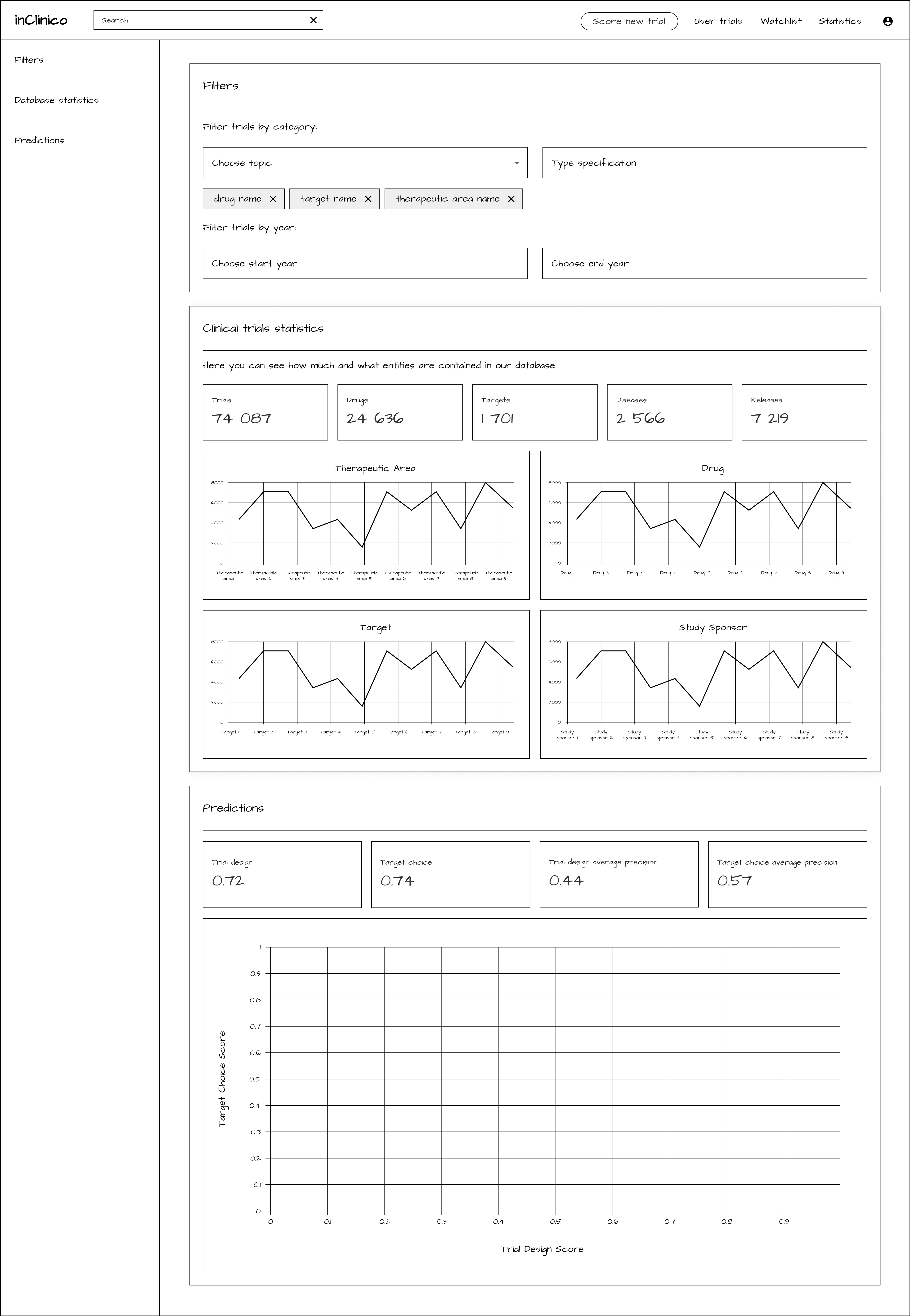
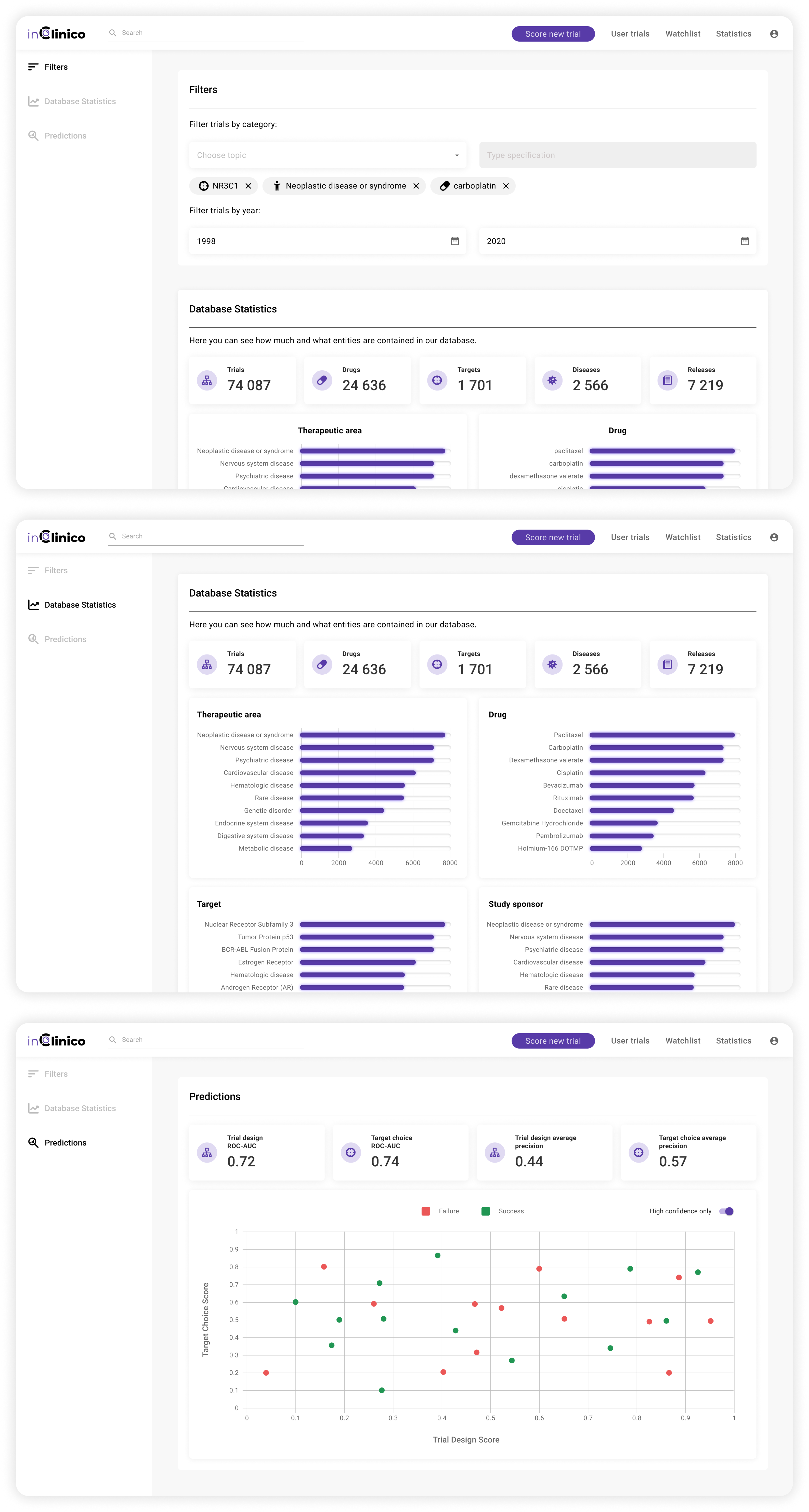
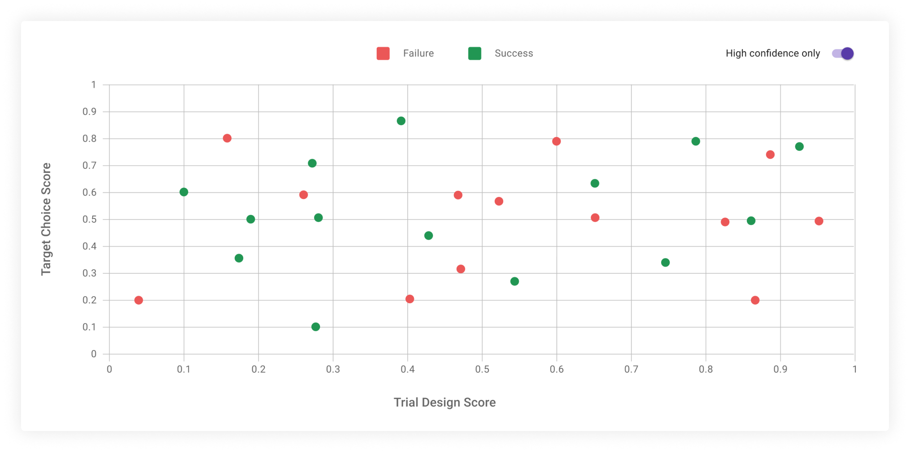
inClinico is a platform that provides data about targets, diseases, clinical trials, and scientists involved with the study at the preclinical and clinical stages. This case study will be focused on the database dashboard, the main goal of which is to present information about past clinical trials.
my role
I worked collaboratively in a team with front-end and back-end developers, a product manager, and a test engineer. I contributed as a UX/UI designer and was involved in the whole design process of the dashboard.
challenge
How can we help clinical scientists from the Pharma industry to identify red flags in ongoing clinical trials and suggest corrections to eliminate the red flags before the first patient is enrolled?
goals
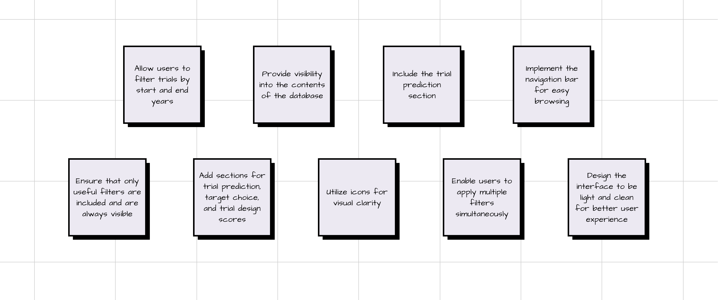
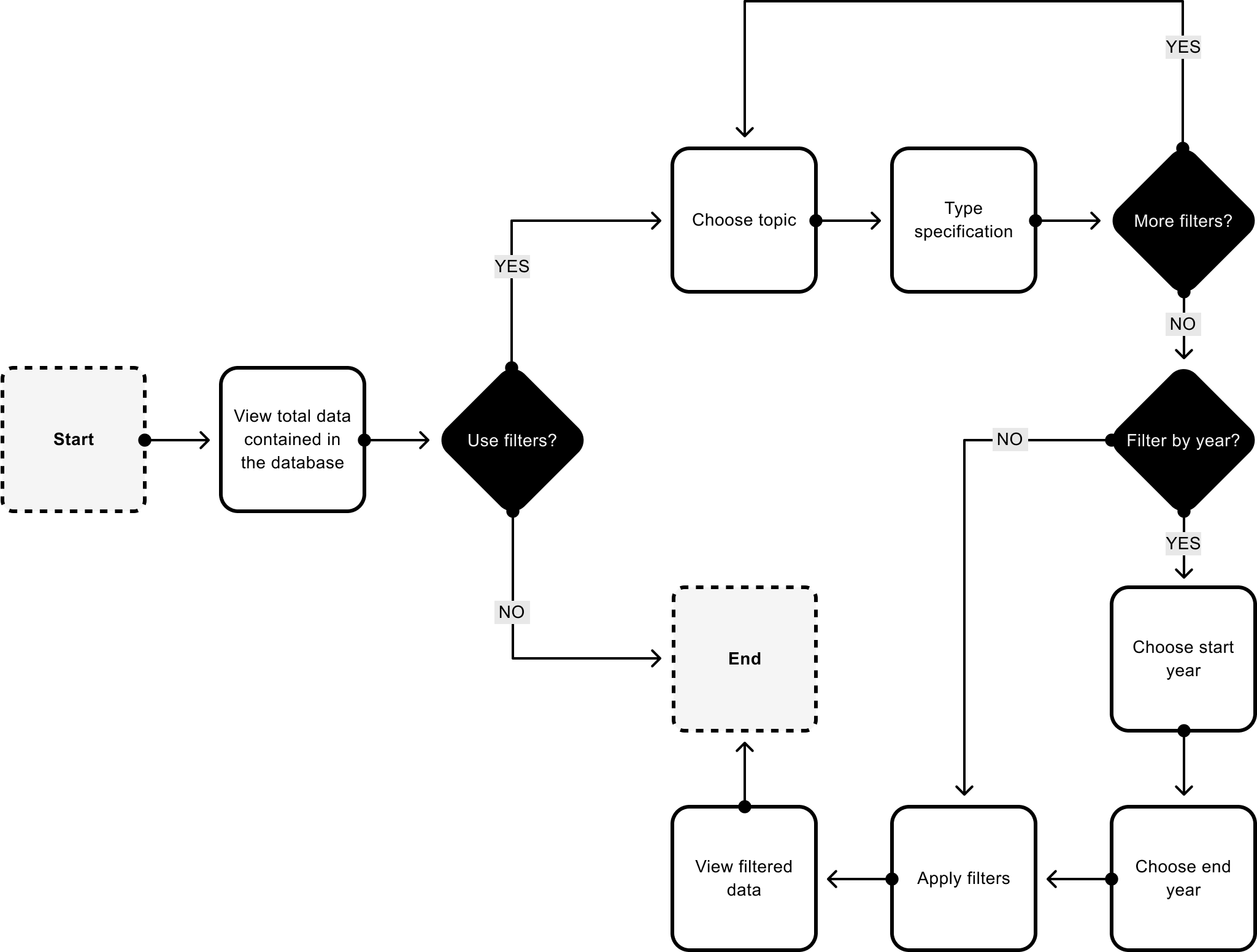
• Provide a didactic resource that shows a comprehensive overview of past clinical trials.
• Enable users to search for clinical trials based on specific criteria.
• Make data clear and readable.