header-frame

Overview πŸ“Œ


FEATURE

background

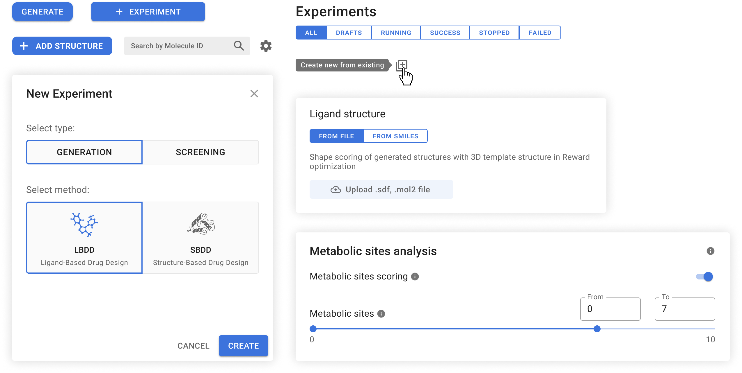
Although Chemistry42 is a software platform for de novo small molecule design and optimization that combines AI techniques with computational and medicinal chemistry methodologies, this case study will specifically examine the experiment feature. The primary objective of this feature is to generate novel molecules through ligand- or structure-based drug design.

my role

I collaborated with front-end and back-end developers, a product manager, and a test engineer on the feature redesign. As a UX/UI Designer, I played a key role in the entire development process of the experiment section.

challenge

What strategies can be employed to assist clinical scientists in the pharmaceutical industry to effectively discover novel molecular structures targeting various biological endpoints?

goals

β€’ Allow scientists to generate molecules using existing drug designs.
β€’ Customize molecular configuration and properties according to users' needs.
β€’ Provide diverse, high-quality molecular structures within hours.

Stakeholder Meeting πŸ’¬

Before initiating UX research, obtaining a stakeholder's brief was crucial. Despite the experiments feature already being implemented in the platform, stakeholders expressed dissatisfaction with it. During the meeting, we identified the issues with the current design, clarified our objectives, and assessed available data since the product was already launched.

Key outcomes of the meeting include:

β€’ The feature lacks several important properties.
β€’ The flow is confusing.
β€’ The interface lacks intuitiveness.
β€’ No user research has been conducted.

Research πŸ”

interviews

"I need to generate an experiment from the existing one, but there is no such button." β€” Alexander M (Principal Scientist).

Since no initial user research had been conducted, we needed to gather feedback from our current users regarding the feature. While we had already identified some general issues during the stakeholder meeting, more detailed research was required to pinpoint specific pain points and gather improvement suggestions.

We began by conducting user interviews with 12 participants, focusing on aspects such as features lacking in the tool, challenges users faced in its usability, what made the flow unintuitive, and users’ goals. Additionally, we observed users using the feature and asked for feedback at each step.

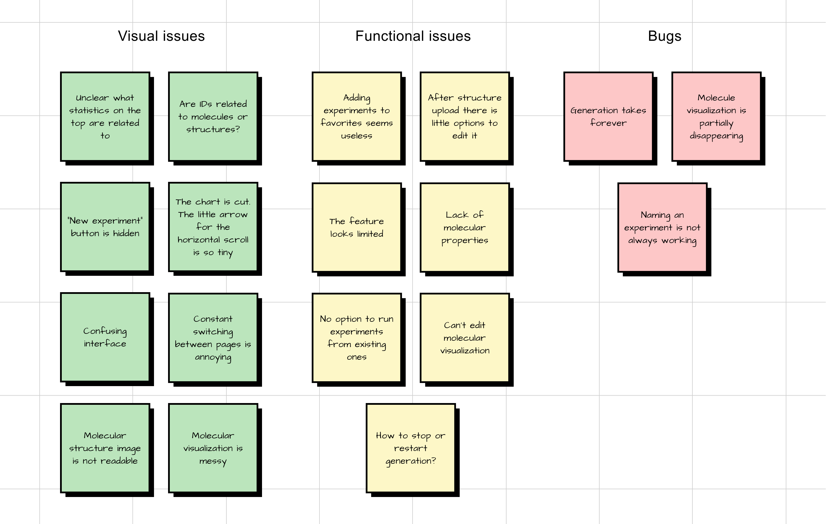
affinity map

processing results

Following data analysis and cluster creation, we gained insights into the obstacles hindering users from reaching their objectives. This facilitated the identification of areas requiring improvement, updates, and additions.

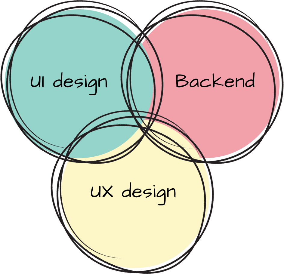
Ultimately, we identified three primary factors with issues: visual design, UX design, and backend functionalities.

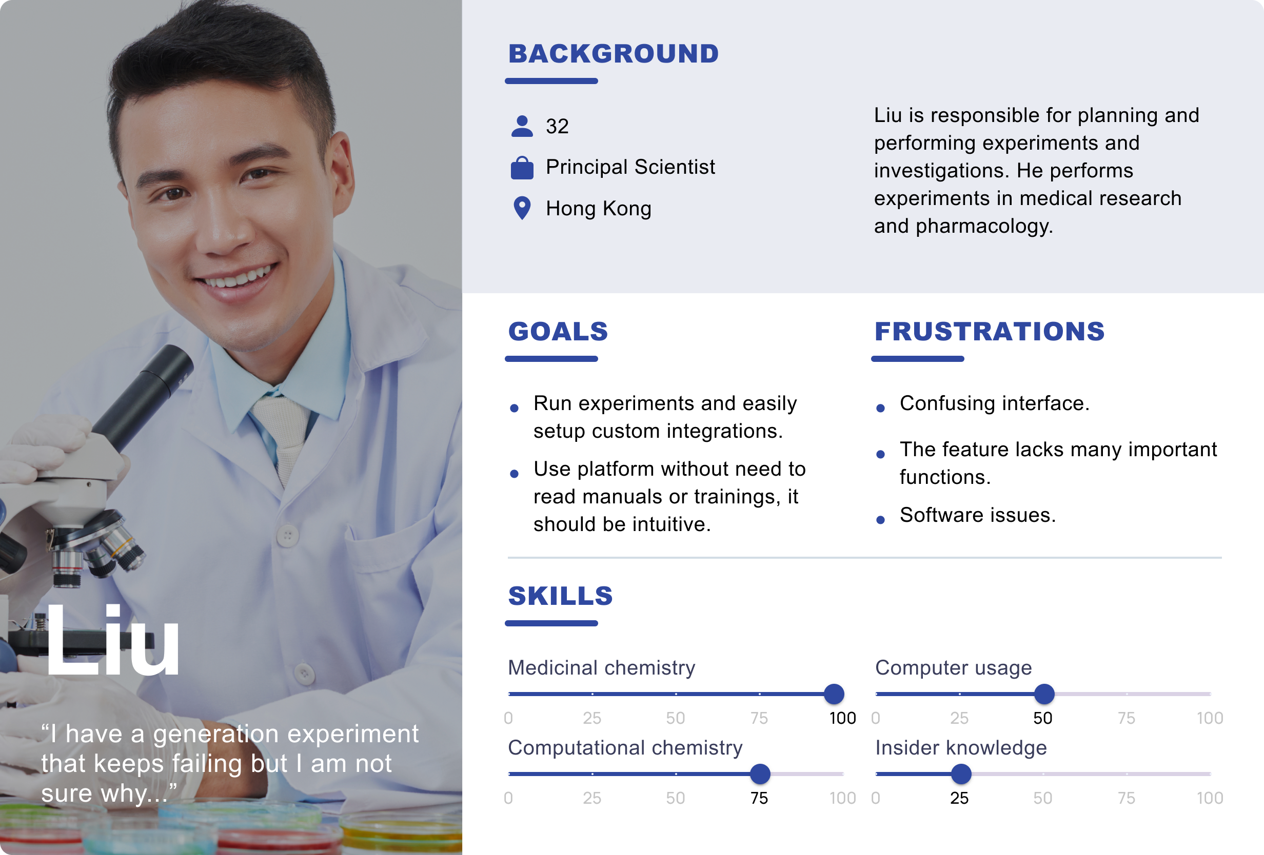
Persona πŸ‘€

Following user research and gathering pertinent information from potential users, we developed a user persona. In crafting the persona, considerations were given to their goals, frustrations, background, and skills.

Ideation πŸ’‘

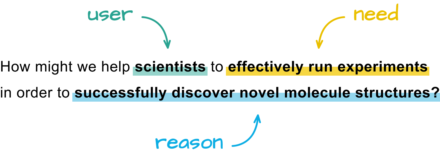
how might we…?

In an effort to encourage brainstorming and foster a fresh perspective on the project, we attempted to reframe the problem statement using the question format, beginning with "How might we." Drawing insights from our research, we developed a Point-of-View based on a deeper understanding of users, their needs, and critical aspects about them.

solutions

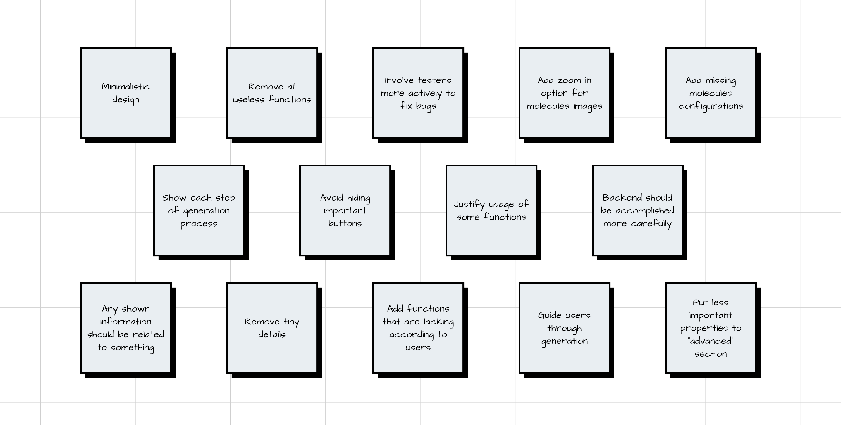
We provided a broad scope to encourage thinking about solutions that go beyond the status quo. The team participated in a brainstorming session to address the proposed question. We solicited ideas from each member about features for the future app, allowing everyone to vote for the most viable ones.

Task Flow βš™οΈ

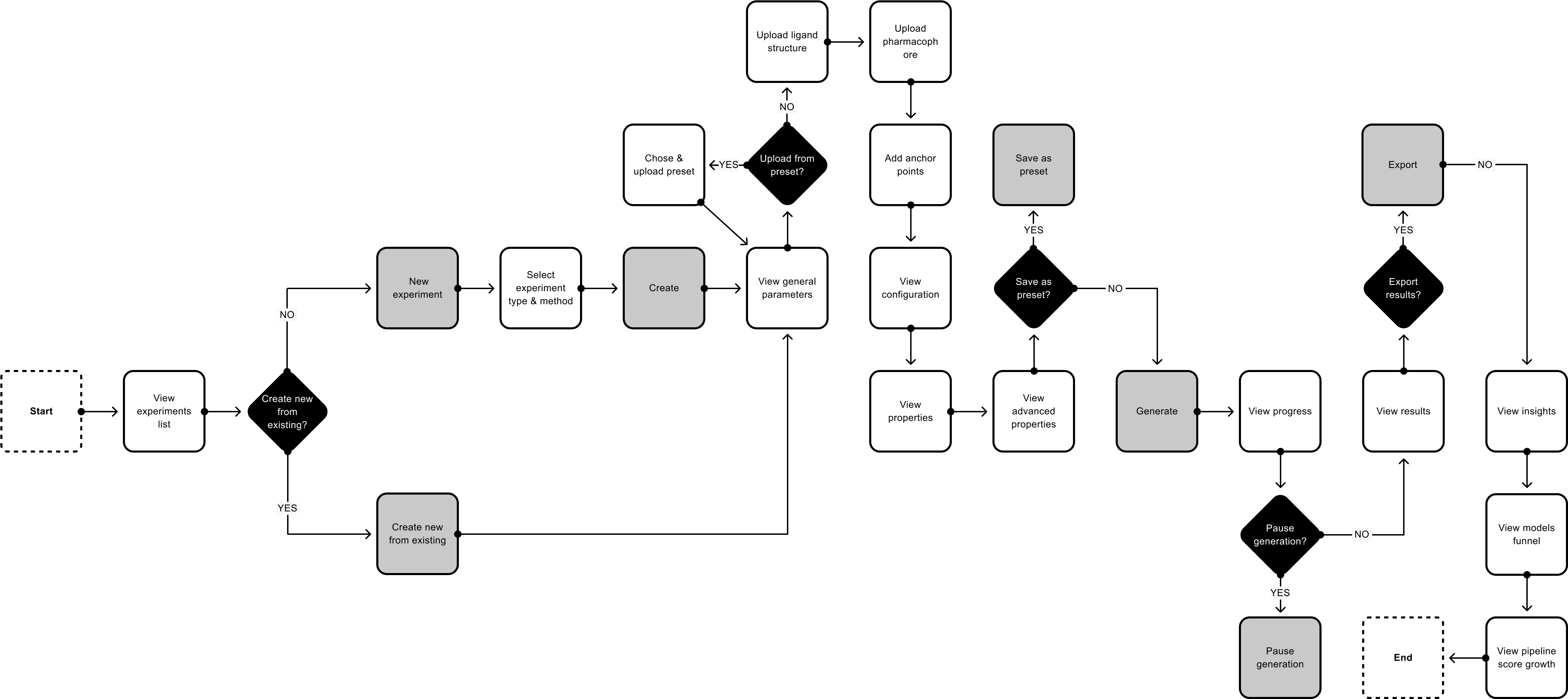
To initiate the redesign of the generation feature, we began by creating a diagram to illustrate the user's task flow. We developed a comprehensive flowchart outlining all potential steps a user might take, from generating creation to obtaining results and insights.

Wireframes ✏️

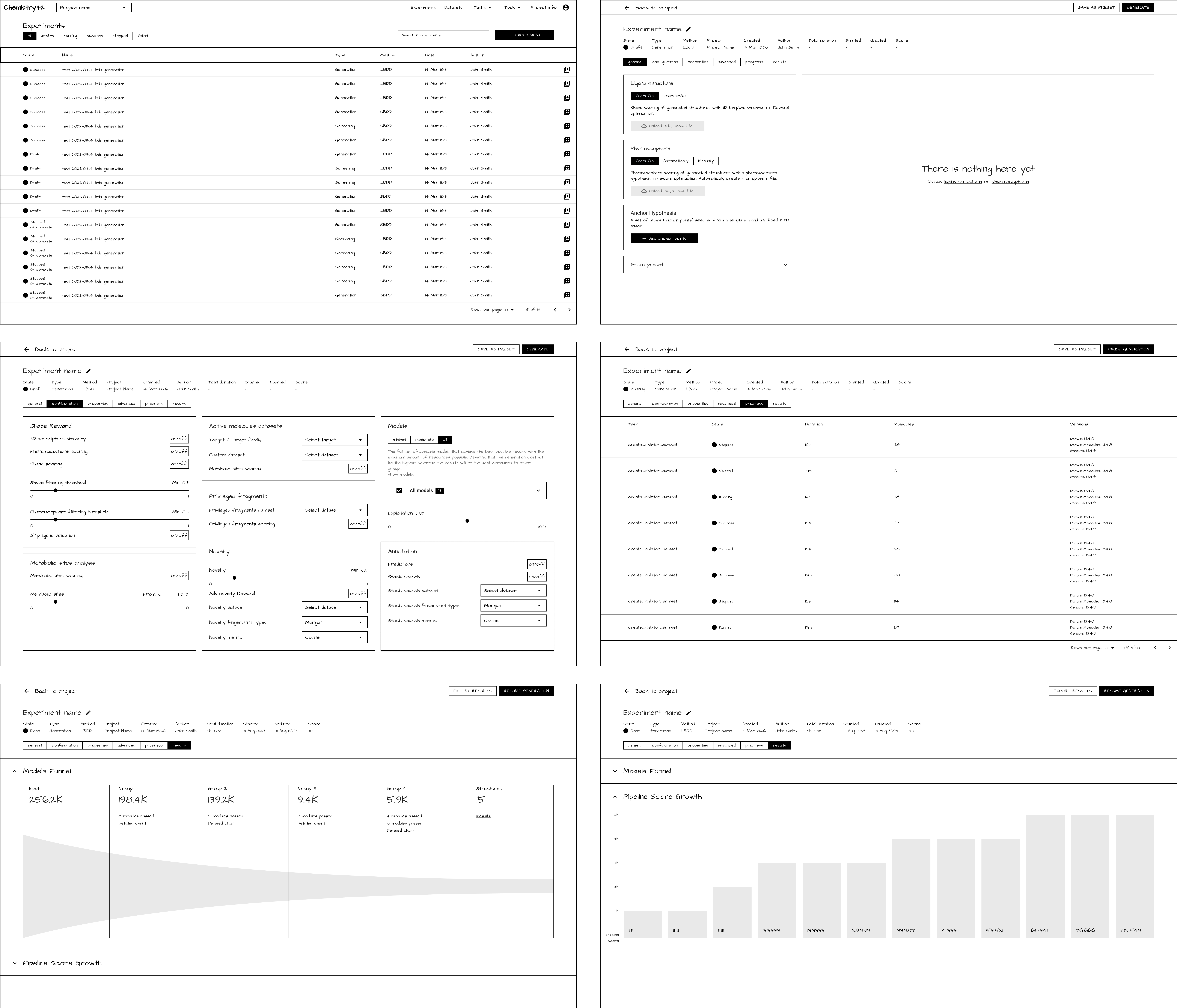
The next step involved creating wireframes to illustrate the placement and approximate appearance of interface elements. This process provided a blueprint of the page structure, layout, information, and functions. Consequently, it gave us a clear idea of both the functionality and visual representation of the new feature.

Styleguide 🎨

brand

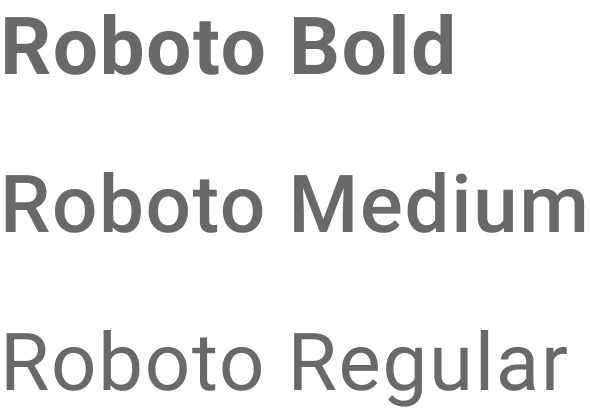
type

icons

colors

controls

While crafting the style guide, our emphasis was on fostering a sleek and user-centric design ethos. Adopting a minimalist approach not only directs attention to key information but also fosters an intuitive comprehension of content relationships. Additionally, the design incorporates custom icons sourced from the Streamline library to ensure a visually unified and intuitive user experience. The selected monochromatic color scheme, complemented by vibrant accents, enhances contrast and readability.

Final UI 🌟

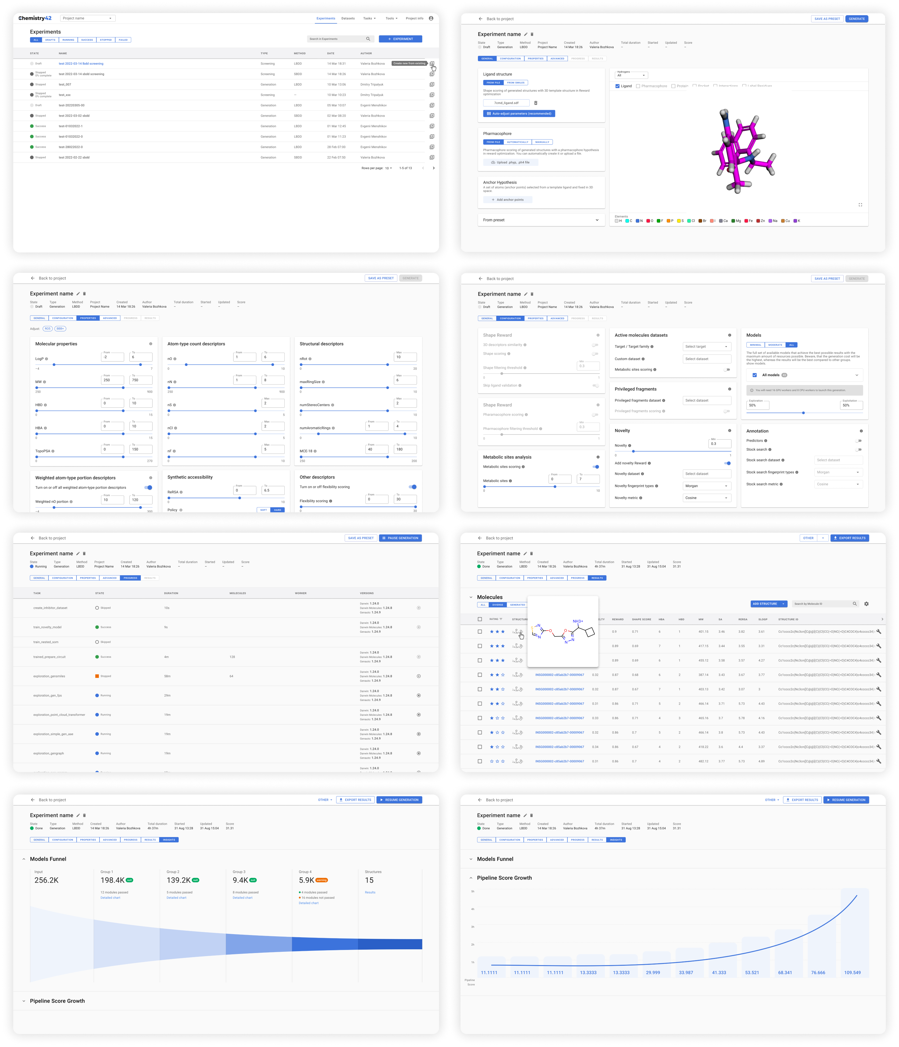
To enhance usability and reduce cognitive load, we developed an interface that prioritizes information through the use of monochromatic components. This approach enables quicker decision-making by highlighting priority content. The layout design was centered on minimizing the user's attention, thereby preventing them from feeling overwhelmed with information.

Usability Testing πŸ“ˆ

For the usability testing, we chose six research scientists of varying genders and ages. We tasked them with various assignments, such as creating and executing new experiments, configuring specific properties, pausing/resuming generation, and exporting results.

outcomes

After conducting usability testing with each participant, we implemented several usability improvements based on their task performance and feedback, including:

1. Adding the option to rename experiments at any stage, rather than just on the main page.
2. Allowing users to save all settings and upload them as a preset template.
3. Implementing the ability to search and filter molecules by structure.

VIEW OTHER CASE STUDIES
footer-frame