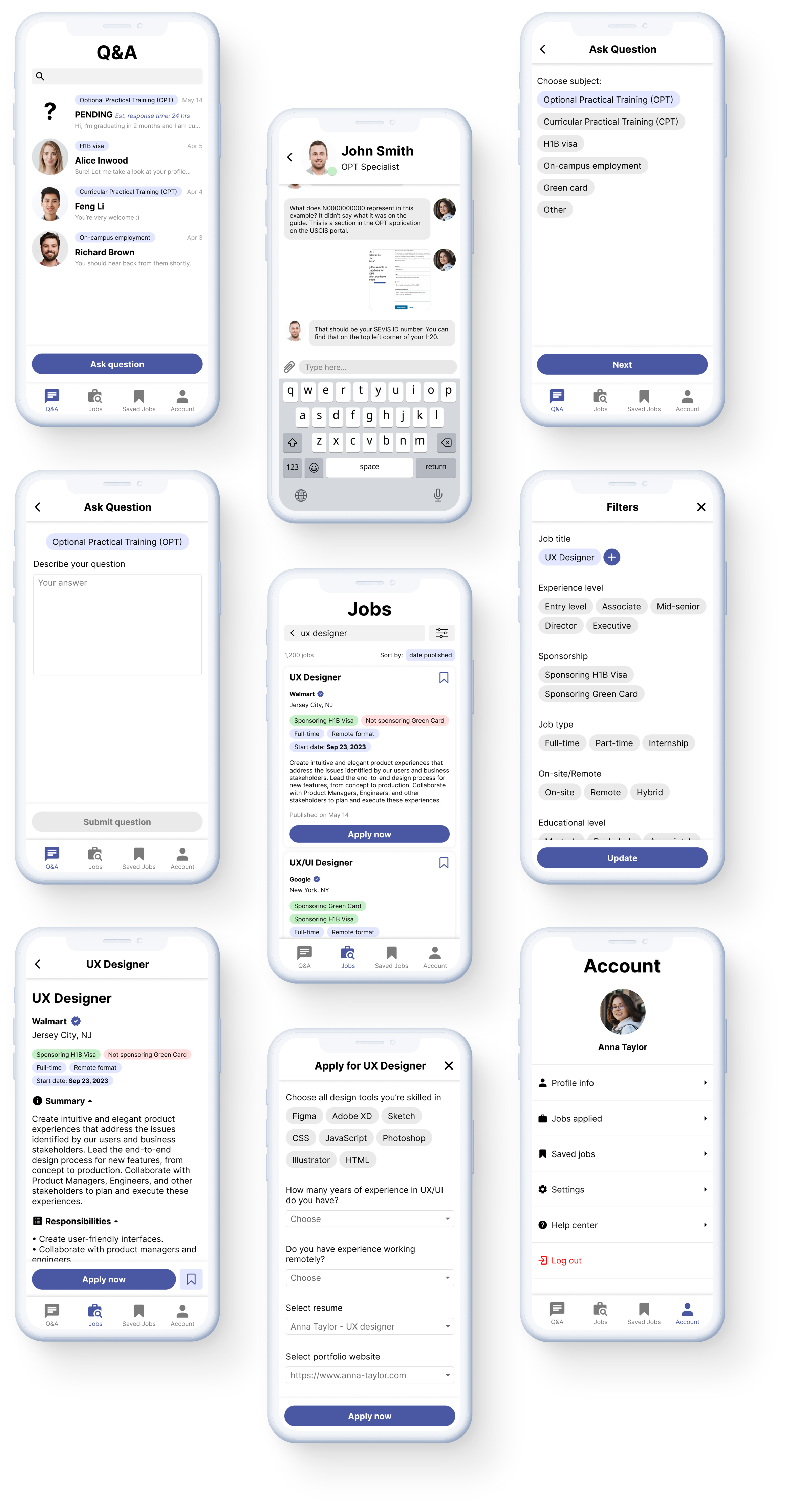
header-frame

Overview 📌


MOBILE APP

challenge

According to NSF, 77% of international students expressed intent to remain in the United States and work after graduation. However, only 46% were able to do so. How might we empower international students to confidently pursue career opportunities and increase their chances of successful employment?

goals

• Offer mentorship and support for international students regarding employment, paperwork, and job applications.
• Make job search based on hiring policies transparency.
• Build a user-friendly platform that ensures a less stressful job search process.

my role

I collaborated closely with another Product Designer throughout the entire process, actively participating in tasks ranging from conducting research and generating ideas to developing style guide flows and crafting final UI designs.
Research 🔍

interviews

"I don’t know where to start with my application and the school isn’t helping at all!" — Tim C (student).

We began by conducting interviews with students at Parsons School of Design. The survey consisted of 20 qualitative questions relating to students’ post-graduation plans, the work authorization application process, sources utilized for job searches, and the challenges encountered by students.

Sixteen participants responded to the surveys. The qualitative research findings enabled us to understand students’ intentions in planning their job searches and the challenges they encounter.

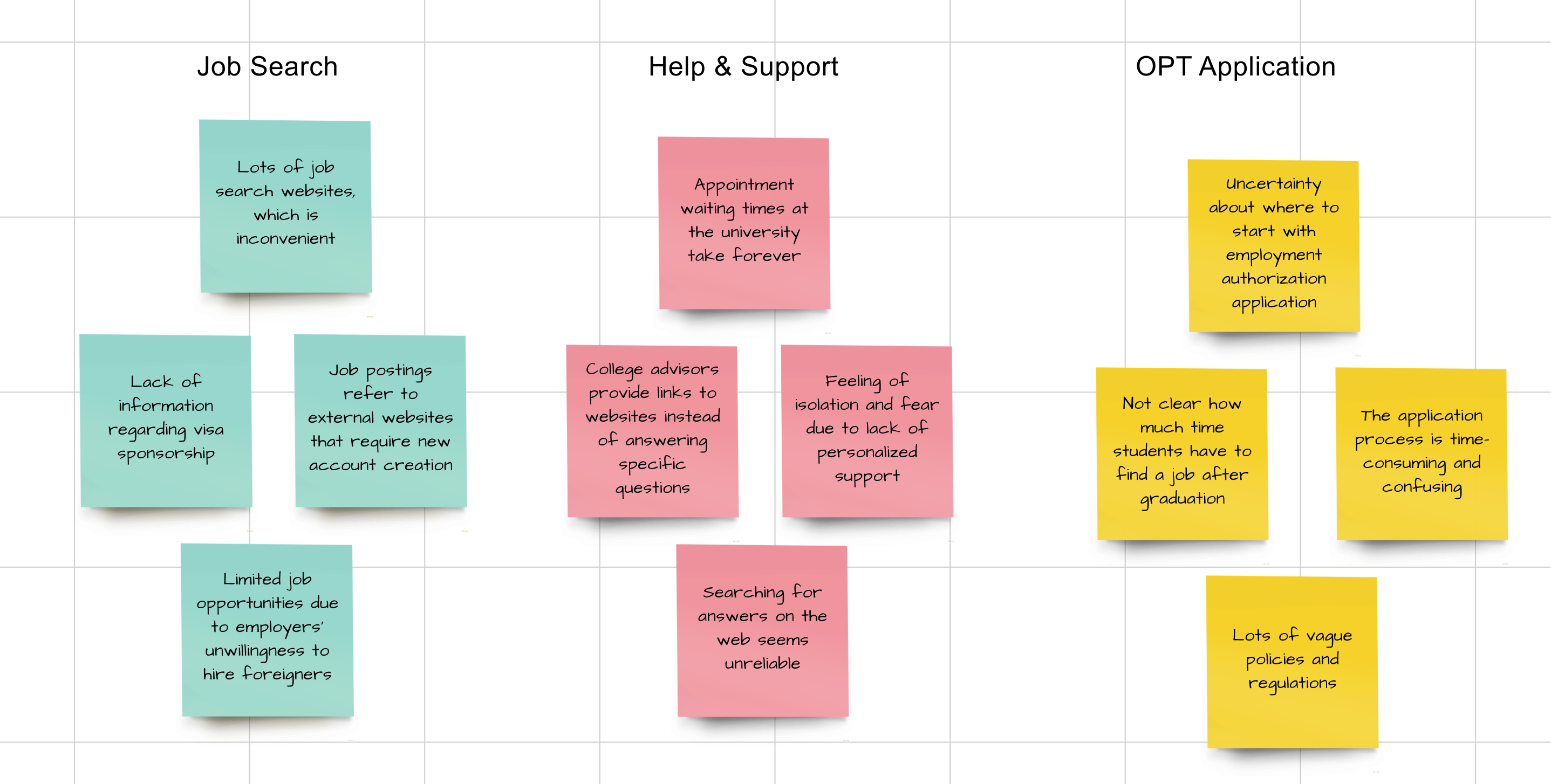
affinity map

processing results

After analyzing the data and creating clusters, we gained a clear understanding of the factors that prevent users from achieving their goals. This helped us determine the main features of our future platform.

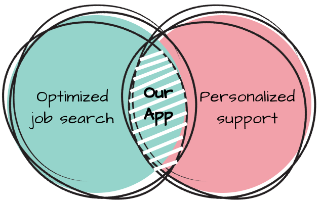
While we cannot influence the government-regulated policies governing OPT applications, we can offer students prompt responses regarding these policies, along with individual mentorship and an optimized job search engine.

Persona 👤

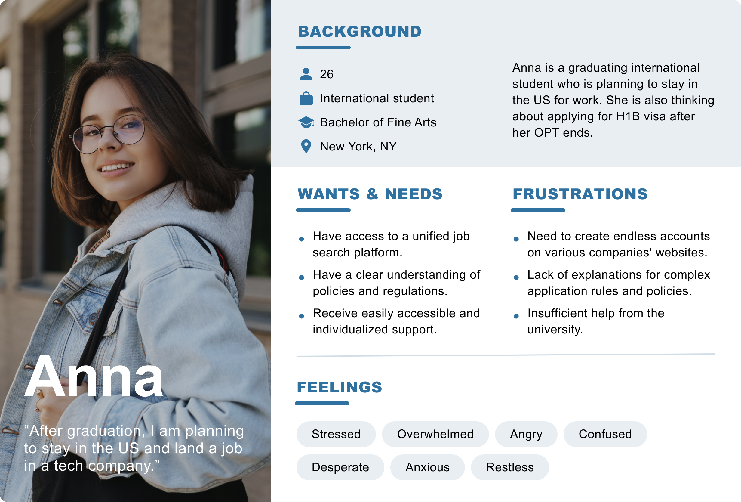
After conducting user research and gathering relevant information from each potential user, we developed a user persona. The entire process of persona development was documented. In creating the persona, we considered their plans, needs, frustrations, personality traits, and emotions.

Ideation 💡

how might we…?

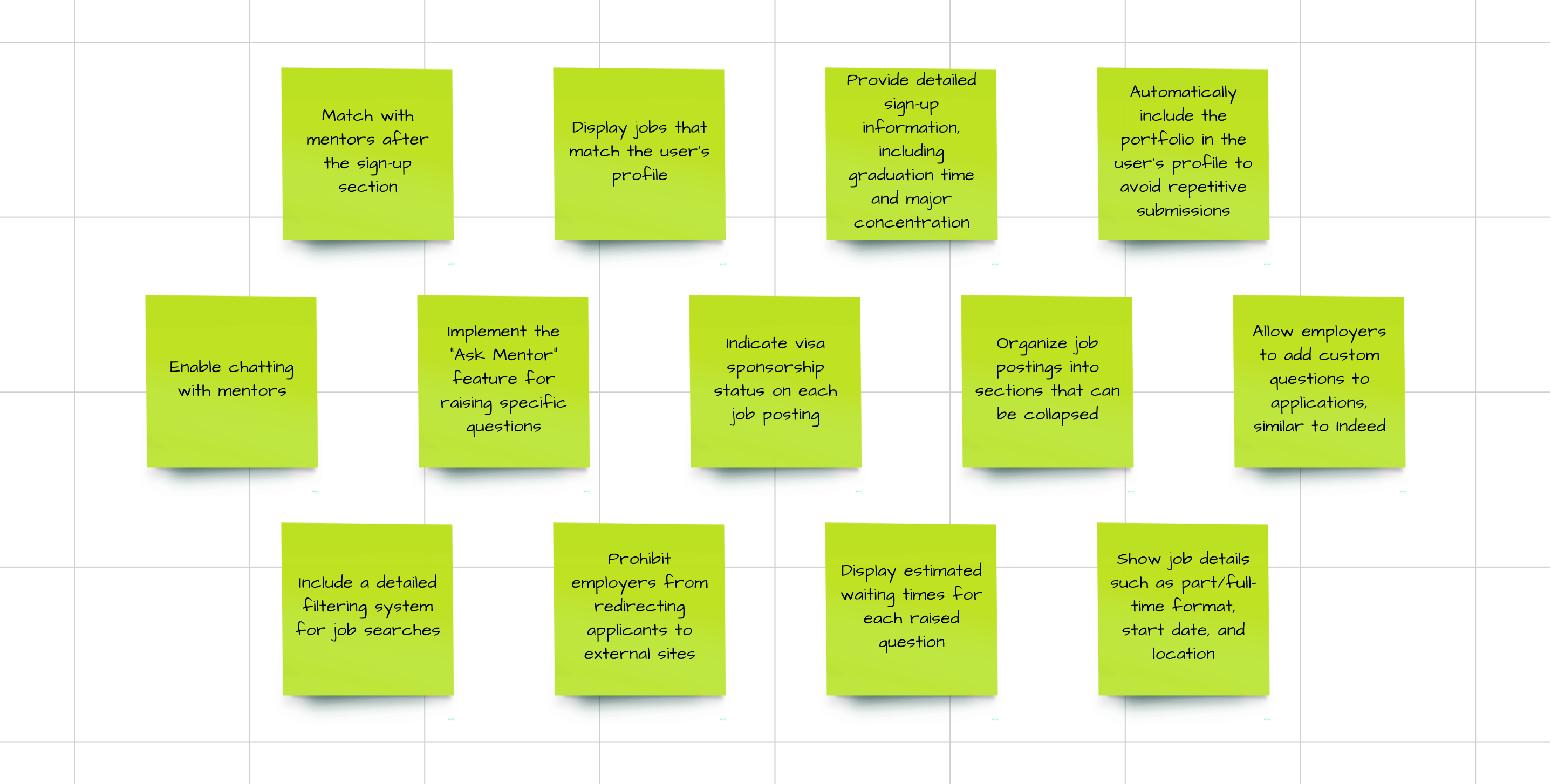
To stimulate brainstorming and foster a fresh perspective on the project, we attempted to reframe the problem statement by posing it as a question, starting with "How might we." Drawing from our research, we derived insights to craft a Point-of-View rooted in a comprehensive understanding of users, their needs, and critical facts about them.

solutions

We presented a wide-ranging question to prompt thinking about solutions that transcend the current state. During a brainstorming session, we addressed the posed question, incorporating input from each member regarding potential features for the forthcoming app, and voted for the most promising ones.

Information Architecture ⚙️

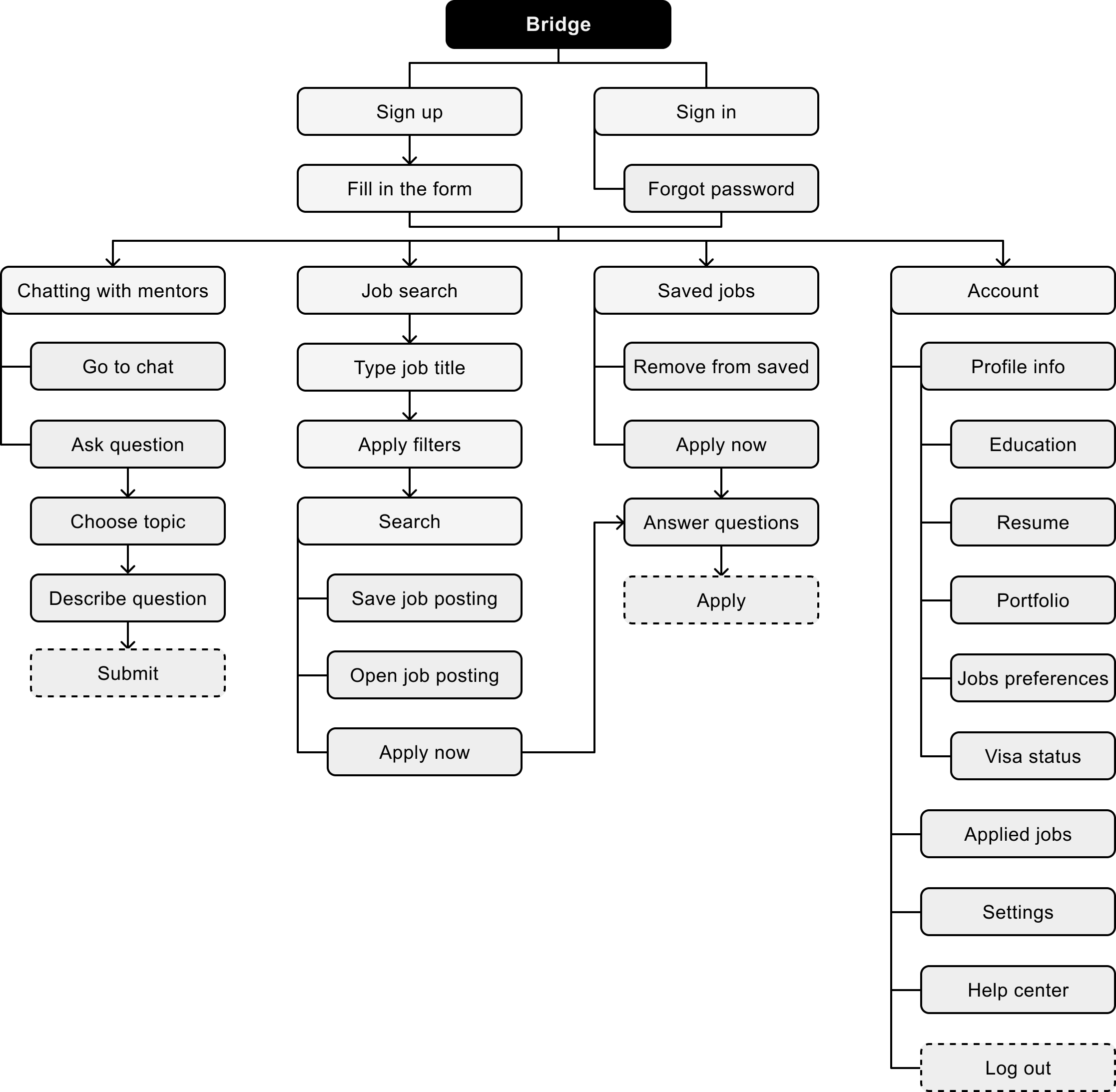
To initiate the development of the actual product, it was crucial to establish the information architecture first. By deeply understanding users’ needs and goals, we identified relevant features that influenced the structure of information. Our aim was to delineate every possible avenue and pathway that users could navigate within our app.

Wireframes ✏️

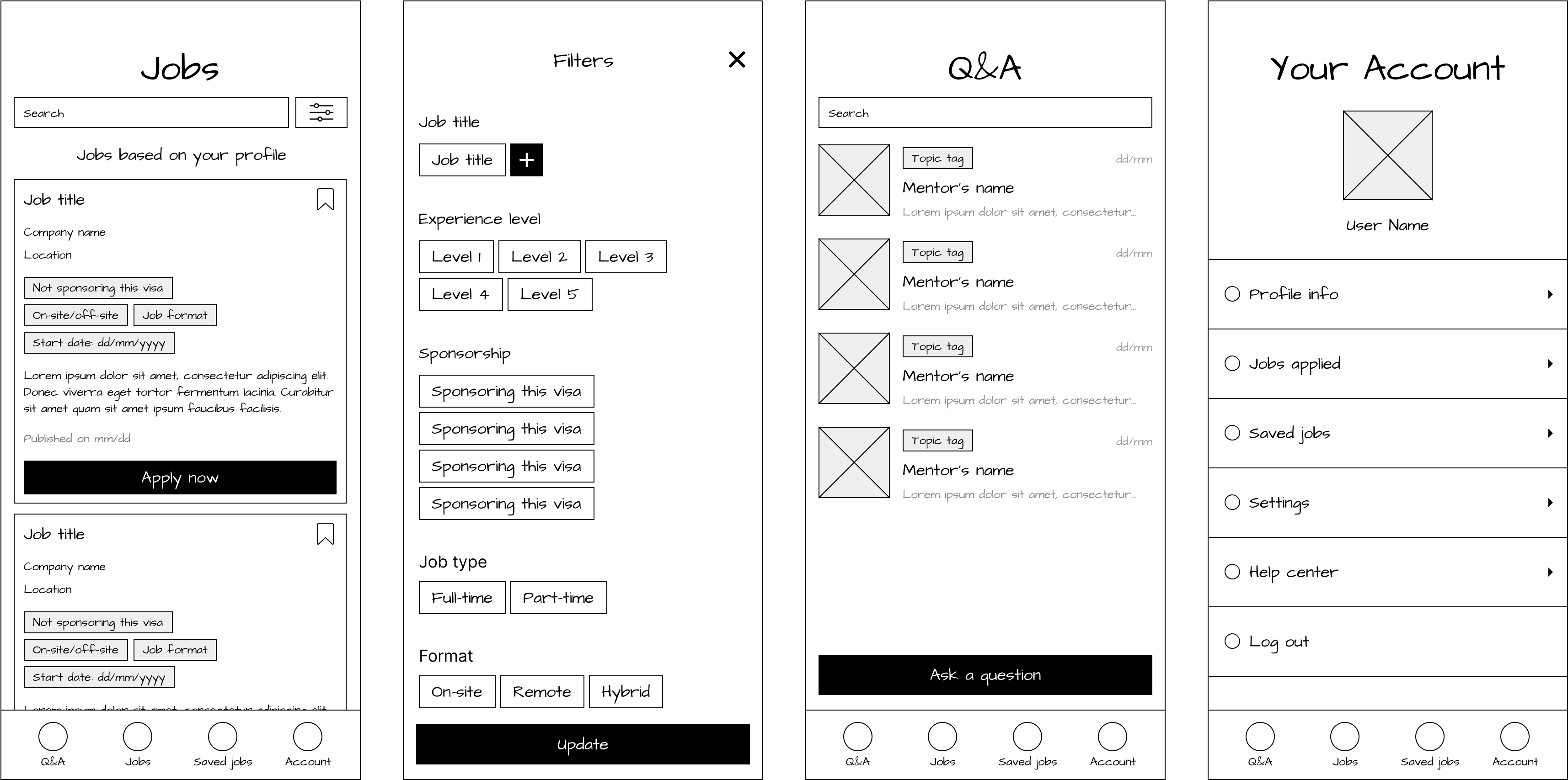
The next step involved crafting wireframes to illustrate the placement and rough appearance of interface elements. This process offered a blueprint of page structures, layout, information, and functions. Consequently, it provided us with a clear understanding of the application's functionality and visual representation.

Styleguide 🎨

brand

type

icons

colors

controls

Incorporating the principles of Gestalt, this project's style guide presents a streamlined and user-centric aesthetic. Using a minimalist approach enhances focus on key information while facilitating an intuitive understanding of content relationships. The design further includes icons, ensuring a visually cohesive and intuitive user experience. The chosen monochromatic color scheme, punctuated with bright accents, increases contrast and improves readability.

Final UI 🌟

To minimize cognitive load and enhance usability, we prioritized information in our interface by employing monochromatic components. This approach reduces decision-making time for users, allowing priority content to stand out. Furthermore, we adhered to the Principle of Calm Technology in our layout design, aiming to require minimal attention from the user and prevent information overload.

Usability Testing 📈

For the usability test, we selected 12 university students of different genders, ages, academic levels, and major concentrations. Each participant was assigned various tasks, such as:

• Search for a specific job using the filtering system.
• Apply for a job and answer the employer’s questions.
• Ask a mentor a question regarding a specific topic.
• Engage in a chat with a mentor.

outcomes

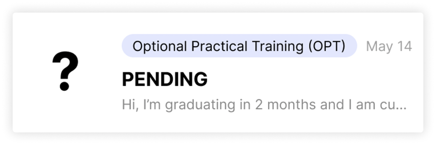
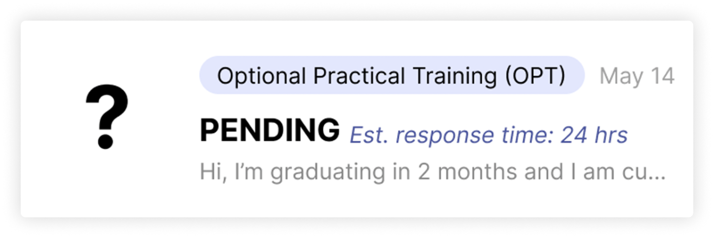
After conducting usability testing with each participant, we identified a few minor opportunities for interface improvement. One suggestion was to add an estimated response time after a question is submitted, as it wasn't clear to users when to expect mentors' answers. Another enhancement involved incorporating a feature allowing users to store multiple resumes and portfolio links, enabling them to choose the most relevant ones when applying for specific jobs.

Before: No time estimate

After: Status with time estimate

After each user completed their task, we asked a few additional questions about their overall experience using the app, including which features were useful and if anything was missing.

We collected valuable feedback on interface improvements. For instance, one user suggested adding an image attachment feature to the chat with mentors, especially if a student's question is related to a specific form that needs to be filled out.

"I am thinking about being able to send screenshots, so that I don’t have to copy all the text from the page." — Yiwen X. (student).

VIEW OTHER CASE STUDIES
footer-frame